
What’s Wrong Here?
How to correct common framing issues.
Have you ever noticed that some framed art just feels right — easy on the eyes — while other pieces make you want to glance away? Sometimes it’s the artwork itself — maybe the style or subject just isn’t your thing, like abstracts or landscapes. But often, it’s the framing that makes all the difference.
Yes, the way a piece is framed can completely change how it’s seen and felt!
To show you what we mean, we’ve taken four pieces of art (each with two mats and one frame) and framed them two different ways. Let’s take a look at how the design choices affect the overall presentation.


Serenity in the Guest Room
This serene, peaceful image is perfect for a guest room with green accents and oak furniture. You might think the top mat should be green to match — and the frame should match the furniture.
Not necessarily.
Neutral colors drawn from the artwork itself (rather than your walls) allow the art to shine while still harmonizing with your décor. By choosing a mat just a shade darker than the light on the water, we keep the focus where it belongs — on the tranquil scene. The frame continues the soft, neutral vibe, creating a calm, inviting feel that draws you into the view.


Family Photograph
There’s no better reason for a family portrait than welcoming a new addition! Wouldn’t it be cute to match the mat to the baby’s outfit pick a brown frame to match those darling curls?
Maybe, maybe not.
If the goal is to highlight the baby, use the framing to guide the viewer’s eye straight to the focal point. Let the outfit’s bold color stand out on its own rather than compete with the frame. In this case, a soft white mat won’t interfere with the blue outfit, allowing attention to fall naturally on the baby and the parents’ delighted faces.
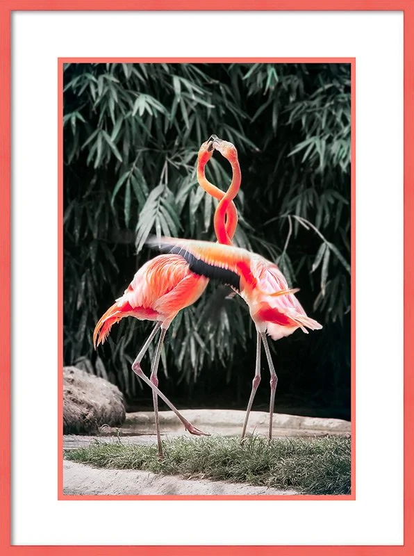
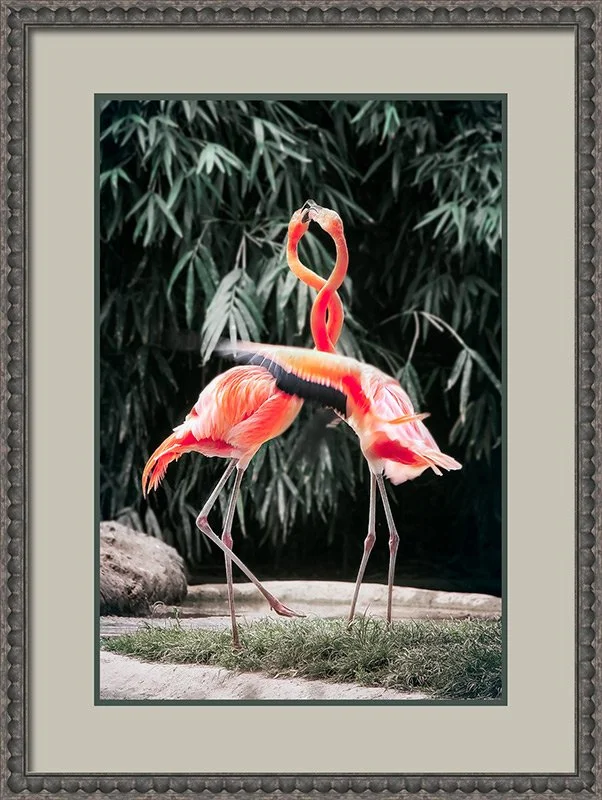
Pink Flamingos
You could watch flamingos all day, so why not choose art that lets you do just that? Naturally, you want the flamingos to be the first thing you notice. It might seem smart to use a white mat to “neutralize” the piece, with a pink frame echoing the flamingos’ color.
Great idea…or is it?
In this situation, the white mat actually draws attention to the pink frame, not the birds. The stark contrast pushes the flamingos into the background, making the frame the star instead of the artwork.
A better approach? Pull colors from the background rather than the focal pinks. This lets the flamingos shine while the frame subtly complements the piece. Suddenly, the flamingos are easy to focus on — exactly where they should be.
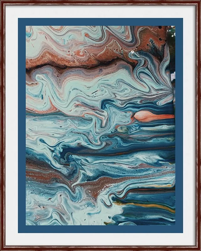
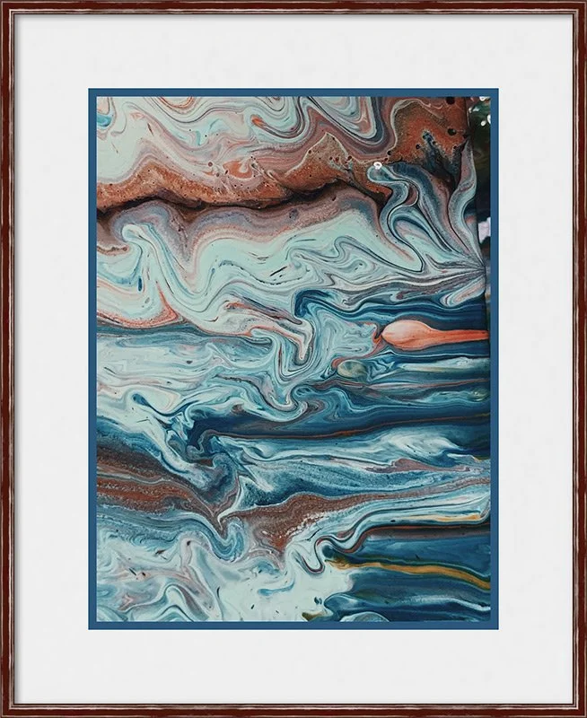
Abstract Art
Abstract art is wonderfully versatile — its non-specific designs often allow it to complement almost any décor. It can bring a sense of calm to a room or inject a bold splash of color. But because abstract pieces can have a lot happening at once, they need space; otherwise, they risk feeling chaotic or overwhelming.
Take this colorful example: it uses the same two mats and frame, but the matting proportions differ. The first version feels cramped, forcing your eye to focus on the frame rather than the artwork. The second version gives the art room to breathe, letting your eyes move naturally across the piece. Which one would you rather spend time looking at?

Rules of Thumb for Framing Design
✓ Stick to colors that are in the art
✓ The mat color should not be lighter or darker than any color in the art
✓ Contrast the top mat with the focal point
✓ Vary the widths of the design package components