
Colorful & Fun
Use color to bring out a range of fun feelings!
Not all art is meant to be serious. Sometimes it's simply meant to be fun! Color plays a huge role in how artwork makes us feel and the atmosphere it creates in a room. The art and décor you choose can instantly make a space feel calm, energetic, cozy, or playful. Understanding the impact of color can help you create exactly the mood you're looking for.
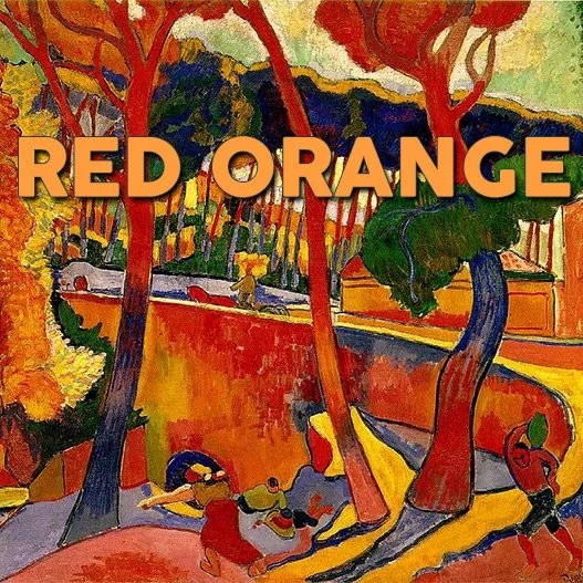
Reds&Oranges
Reds and oranges are high-energy colors that stimulate both the body and mind. They’re often associated with strength, activity, and appetite, which is why they’re commonly used in spaces like dining rooms and gyms. These warm tones can help create a sense of intensity, warmth, and motivation in a room.
Painting by André Derain, L’Estaque, 1906
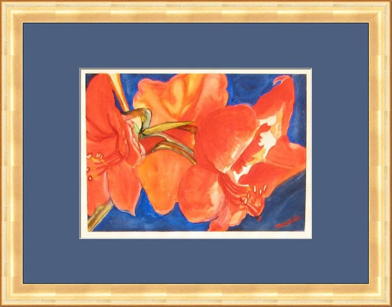
In this image, the vibrant orange flower carries a strong sense of energy and warmth. Introducing its complementary color, blue, enhances the contrast and makes both colors appear more vivid and balanced.
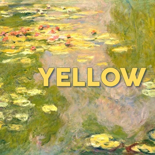
Yellows
Yellow is often associated with uplifting energy and positivity. It’s believed to stimulate the nervous system, promote a sense of clarity, and help reduce feelings of stress. With its bright, cheerful quality, it’s no surprise that yellow is a popular choice for kitchens and other spaces meant to feel warm and welcoming.
Painting by Claude Monet, Water Lilies, 1919
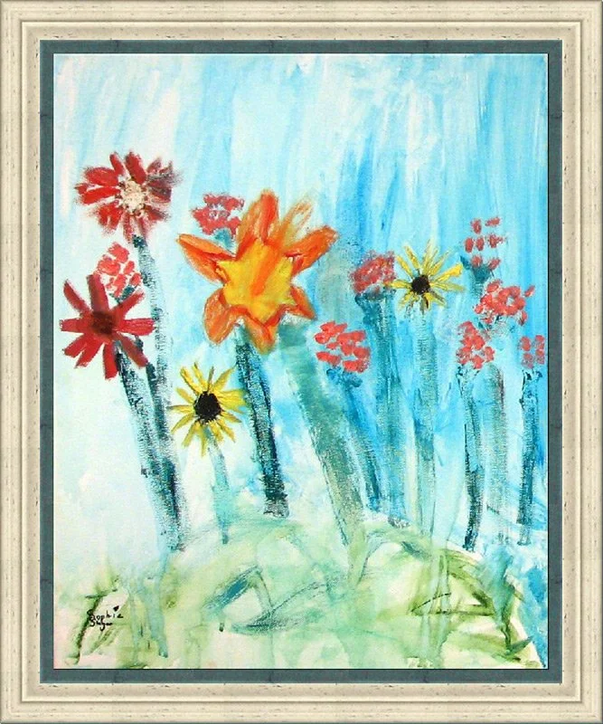
The yellow and orange flowers bring a lively, playful energy as they sway in the breeze, while the blue background balances the scene with a calming, soothing effect. Together, the warm and cool tones create a pleasing sense of contrast and harmony.
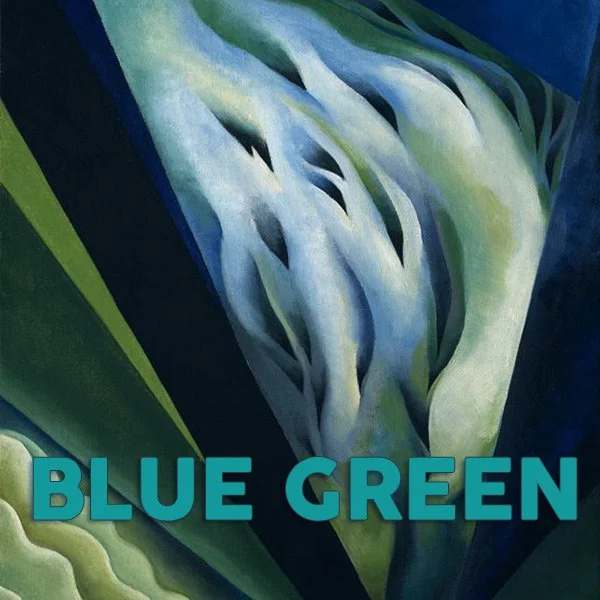
Blues & Greens
Blues and greens are associated with balance, stability, and relaxation. They tend to have a calming effect on the mind, helping to reduce stress and promote a sense of ease. It’s no coincidence they’re often used in spaces like spas and medical offices, where a soothing atmosphere is especially important.
Painting by Georgia O’Keefe, Blue & Green Music, 1921
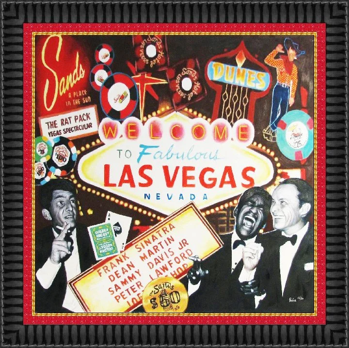
The red inner frame highlights the energy and excitement of this playful Las Vegas print, adding a sense of passion and intensity that enhances the overall composition.
White Mat or Black Mat?
White acts as a natural neutralizer. When artwork is full of color or visual movement, a white mat helps simplify the presentation and keeps the focus on the piece itself.
Black creates strong negative space, isolating the artwork so it stands out with greater intensity and contrast.
White offers a contemporary feel—fresh, clean, and uncluttered.
Black delivers a more sophisticated, elegant, and dramatic presentation.
White is especially effective when creating a cohesive, unified look across multiple framed pieces in a collection.
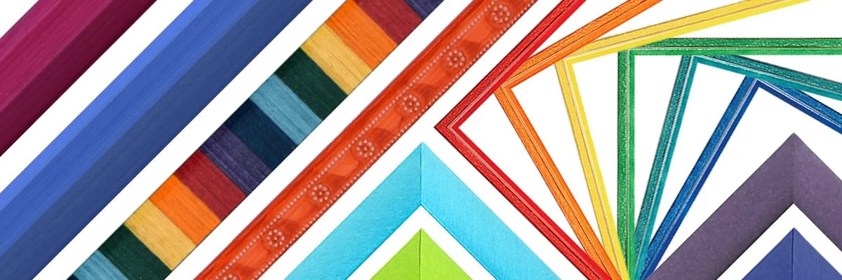
Colorful Mouldings
Sometimes it’s fun to use a colorful moulding – here are some examples of what we carry.
According to color-related research and studies:
Warm-colored placebo pills (such as yellows and oranges) have been reported as more effective than cool-colored ones (like blues and greens) in some contexts.
Blue street lighting has been associated in certain studies with reductions in crime.
Red has been linked to faster reactions and increased force, which may be beneficial in athletic performance.
Black sports uniforms have been observed to receive more penalties in some sports settings.
Office environments painted in blue and green have been found to promote feelings of calm, focus, and optimism. A 1999 Creighton University study suggested employees in blue-toned offices felt more centered and hopeful about their work, while blue is associated with lowering heart rate and green with reducing anxiety and financial positivity, making the combination a popular choice for workspaces.
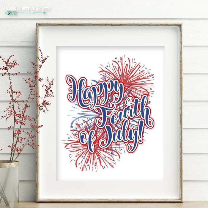
We will be closed on Saturday, July 4th in observance of Independence Day.
Wishing you a safe and enjoyable Fourth of July with family and friends.